Maps Credit Union: Navigating a Transformative Experience

MAPS CREDIT UNION OF SALEM, OREGON, WANTED A FRESH MEMBER EXPERIENCE.
In a competitive financial industry, Maps wanted their branches to reflect their new tagline of “Navigating life. Together.” They wanted to o er an experience that reflects who they are today and projects where they will be tomorrow.
To help them rise to the challenge, Maps teamed with Seattle-based Weber Marketing Group, a user-experience design and brand partner that specializes in creating transformative experiences.
“It was a true collaboration,” said Traci Kendall, Maps’ V.P. of Operations. “Weber helped us build an aligned vision and advance many of our processes to create a simpler, easier and more consistent banking experience for our members.”

Maps' branches were caught in a 1970's time warp and needed a bold upgrade.
Weber Marketing’s Director of Retail Experience, Ruth Kapcia, said Maps had four key goals.
“The first was obvious: to create brand consistency across the branch network by bringing new brand standards into the physical space,” she said. “The second goal was to elevate member service by creating a space where collaboration and education could strengthen member relationships. The third was to introduce new technologies to make banking simpler and increase usage rates. The final goal was to increase employee satisfaction by creating a dynamic environment that generated excitement and ownership in living the brand.”
“Weber helped us build an aligned vision and advance many of our processes to create a simpler, easier and more consistent banking experience for our members.”
After Maps, and Weber’s construction partner Momentum, completed the prototype design phase and started remodeling the first branch, the Maps team took the project a step further: To “brand-wrap” four of its branches in back-to-back installations.
“We were impressed with how the new prototype brand kit of parts would change and how the Weber team could roll out multiple branches in a cost-effective manner,” said Kendall. “So we opted to accelerate our efforts.”
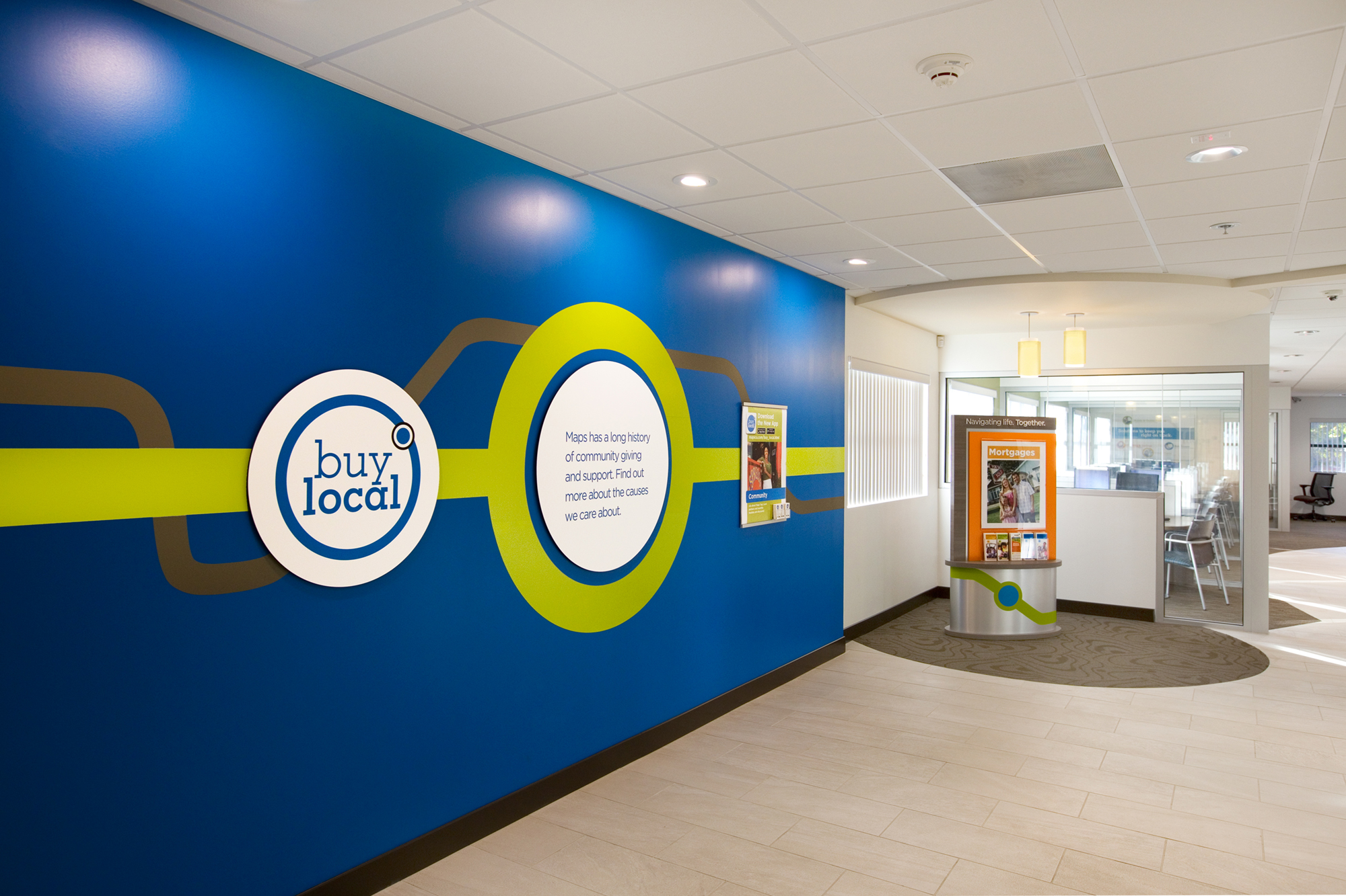
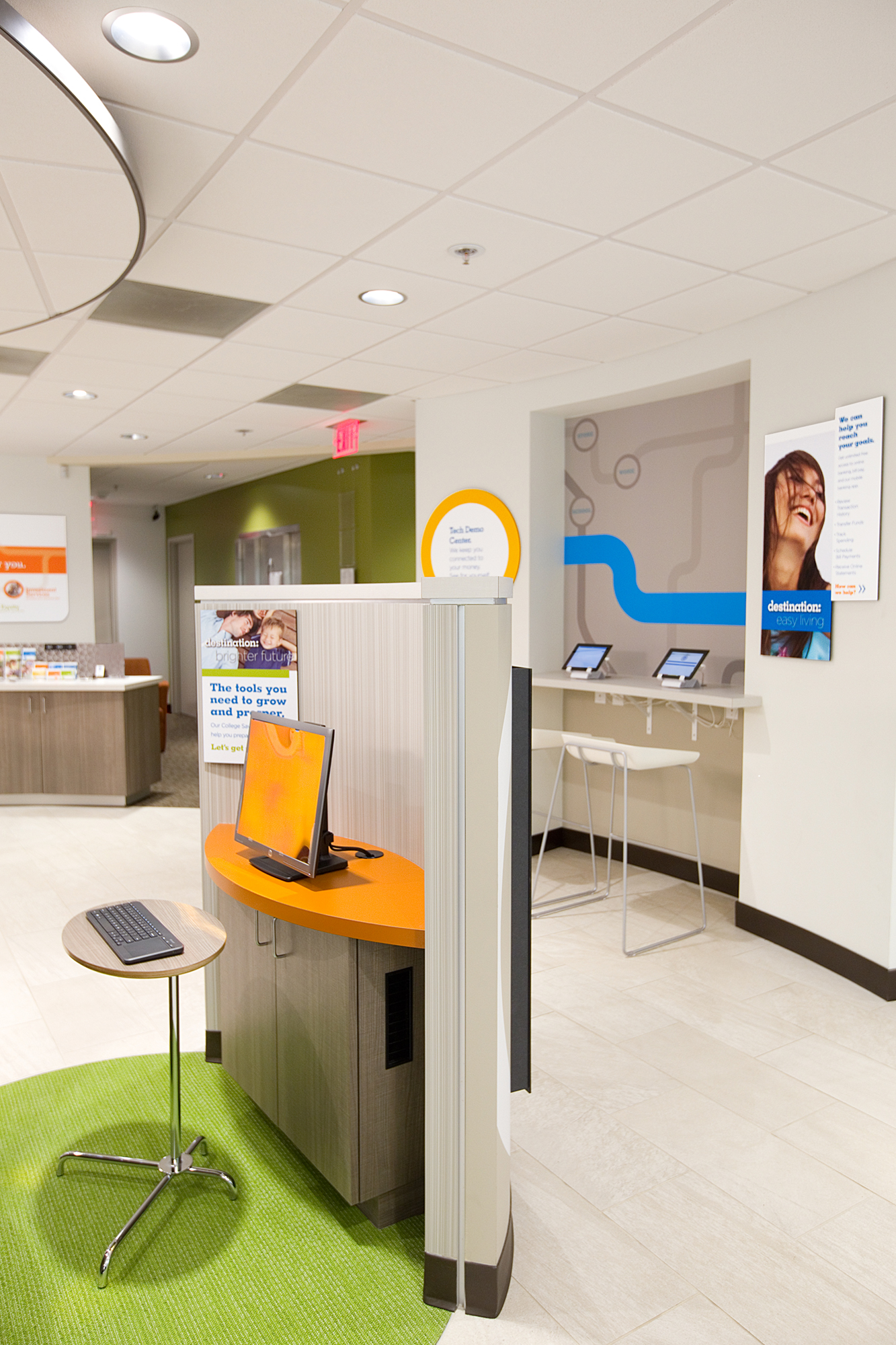
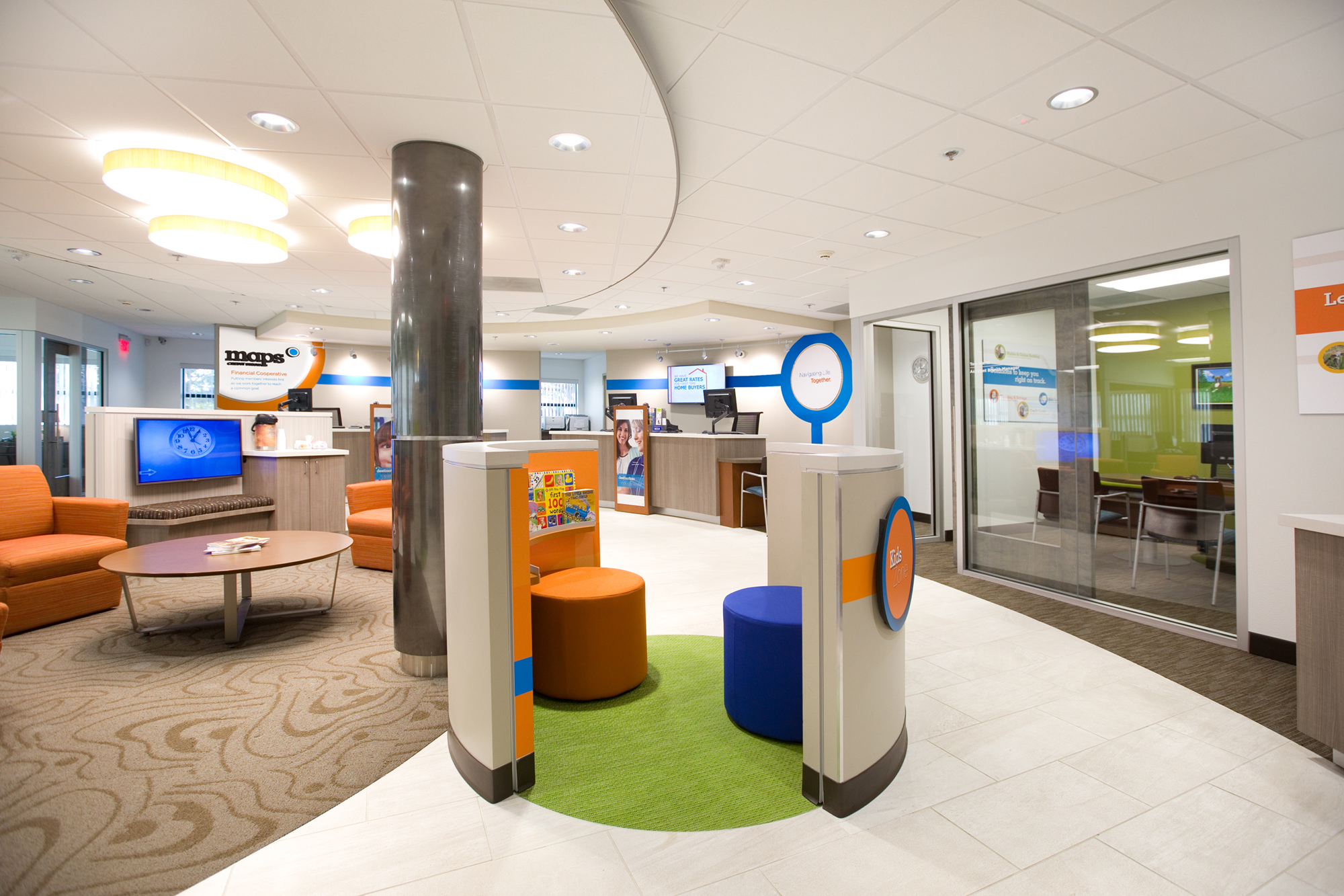
Weber brought Maps’ brand to life by giving each branch a clean white interior, then splashing it with spots of the credit union’s color palette.
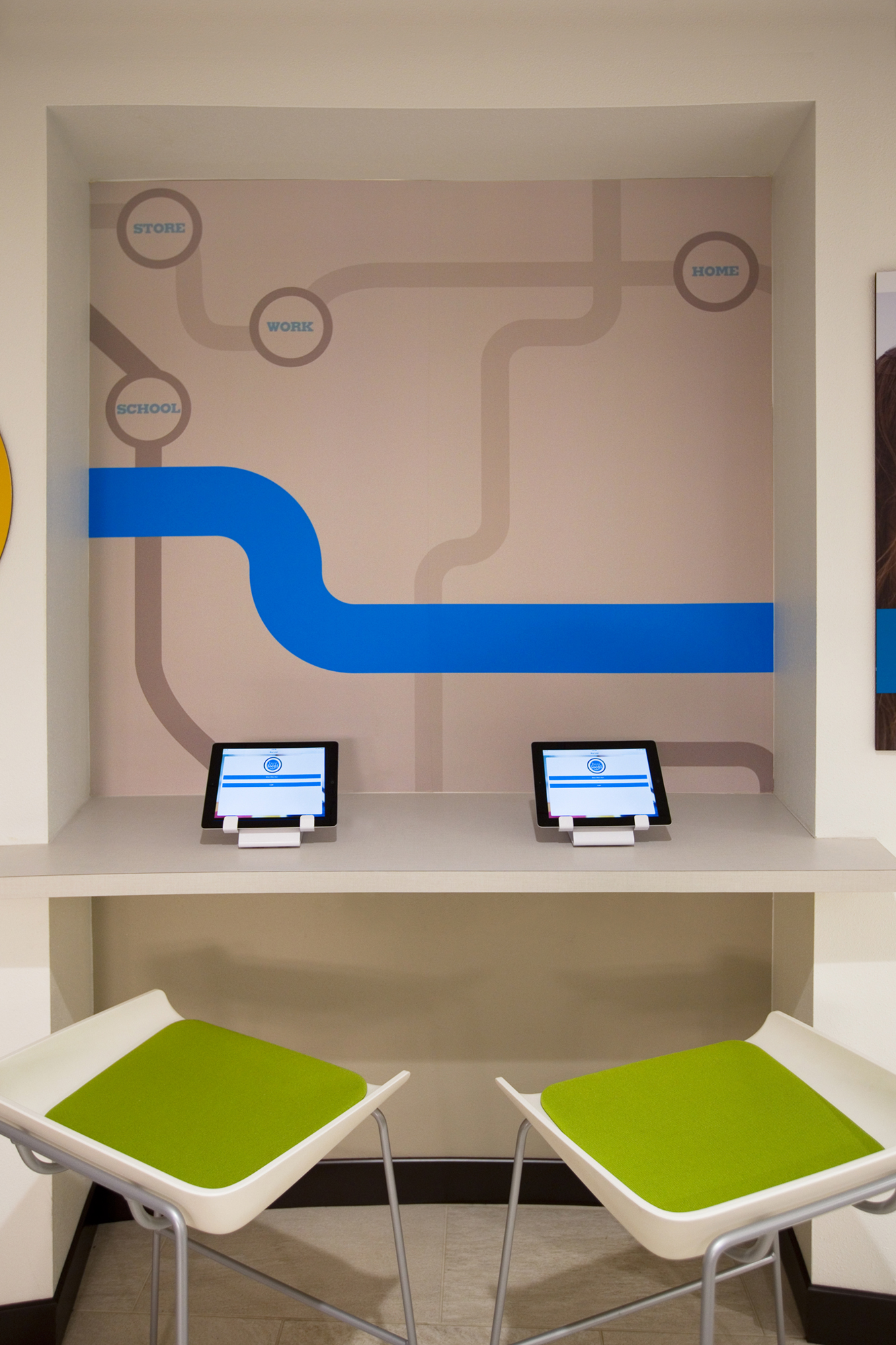
Then they added graphics that echo the design of a subway map. The lines draw members’ eyes from one part of the branch to another. Circles that look like subway stops on a map designate where members can pause to check out services or take a break. They can test the credit union’s mobile and tablet apps on the iPads parked at the Technology Bar. They can log into online banking at the computer at the Online Station. They can surf the Internet for a new car or house while relaxing in an easy chair and accessing the branch’s free wi-fi on their laptops. They can enjoy Maps’ stories unfolding on a video screen on the wall.
“The teller feature wall is a prominent brand display that links lines, circles and digital displays into a modern stylized roadmap,” says Weber’s Kapcia. “We elevated their cooperative philosophy and brought their products to life with branded digital video content and brand storytelling.”
Bold wall murals with graphic brand signatures complete the modern look and vibrant feel of the branches.
“The brand is now fully integrated consistently into the design of each branch,” says Kapcia. “And each is unique, the brand identity and key product messaging is aligned across all branches.”
Kendall said that Maps is very excited about the transformations of its branches. “It helped us change our brand experience and our image of smarter and simpler banking options,” she said.