

How Countryside Bank Went from Serving Builders to Brand Building

CAN A BANK REINVENT ITS BRAND WHILE STILL ROOTED IN ITS PAST SUCCESS?
Founded in 1975 by Jack Wheeler and his partners, State Bank of Countryside (SBC) developed its foundation in the booming Chicagoland residential construction market. SBC enjoyed an amazing 33-year run of successful and profitable growth.
SUCCESS SEVERED BY THE FINANCIAL CRASH.
While the bank had flourished during the construction boom and for 33 years prior, when the 2008 recession hit, local development and construction ground to a halt—and new sources of business and income became critical.
The bank was losing customers and revenues and needed to take bold steps to stem losses. John Wheeler, President and the son of founder Jack Wheeler, knew it would take a bold and robust enterprise-wide turnaround to get the bank headed back in the right direction. Wheeler shared, “We had built an amazing high performing bank but it was time for us to modernize our brand image in the market, expand our product line, update our delivery channels and redefine our brand for the next ten years.”

The old website experience was not simple or helpful.
“It was time for us to modernize our brand image in the market...”
AN ENTERPRISE-WIDE BRAND TRANSFORMATION BECAME MISSION CRITICAL.
In 2013, senior leadership identified that if the bank was going to draw new customers and shift to growth mode, an inside-out, top-to-bottom assessment of its current marketing, branches and delivery systems (along with a brand transformation), would be paramount to the bank’s path towards growth.
SBC called on Seattle-based brand agency, Weber Marketing Group, to launch a needed brand assessment. This effort included customer and internal market research, branch audits, prototype development and brand strategy to refocus the bank’s dated brand, branches and delivery systems. The SBC brand was in need of not just a “refresh,” but a total engagement of its staff and management to refocus enterprise-wide. The end goal being to modernize and create market appeal to key growth segments.
The Weber Marketing team started with a brand road map of what SBC would need in order to establish itself as a modern and distinctive community bank offering a wide range of services. Weber Marketing led surveys, focus groups, market research, and workshops to engage the culture in the change. Customer market research around brand and service perceptions and desired changes ensued. Ultimately, the brand strategy led to key findings and recommendations that guided the changes ahead.
The bank’s SVP of Marketing Diane Brennwald shared “One key positive research insight for our brand was our long-time strength and admiration amongst residential construction leaders. But we needed to find a way to leverage that reputation and our loyal client base to a wider retail banking consumer and small business audience.”
WHAT'S IN A NAME? A LOT MORE THAN JUST LETTERS...
One of the major steps uncovered during the transformative rebranding of SBC was the need for a name change and new brand identity. Customer research determined that the bank needed to simplify and modernize its overall brand. The geographic-oriented name was so long it had been shortened to an acronym over time (SBC). It was limiting the identity of the bank to a single small market area.
The Weber Marketing team suggested that the State Bank of Countryside name be simplified to Countryside Bank. A modern and timeless new corporate identity was designed.

Old logo.

The new modernized logo honors the bank's history.
“Theirs is ultimately a story about building lives, which translates well to a broader audience.”
“By keeping some continuity to our historic name, we could modernize the logo and update the bank’s image profoundly, while still honoring our long-time customers and partners. It was important to us they knew we were still the same bank, under the same ownership” shared Countryside’s Brennwald.
The name modification set the foundation for a modern and progressive brand identity: A bold new color system, an optimistic tone-of-voice, a vibrant personality and strong new messaging.

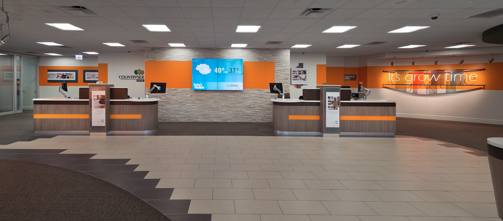
The new branch prototype brings the "Build" brand to life.
DEFINING THE STATE OF THEIR BRAND.
Following extensive brand evaluation, it became obvious the brand was not clearly defined, staff was unclear how to articulate their brand, and messaging had become inconsistent. There was not a clear brand promise or a personality defined for the bank. And the customer deposit base was aging, creating a need for attracting new younger customers. This lack of brand distinction is familiar to many community banks in the wake of the financial crisis and a dynamically changing technology market that’s fraught with new competitors.
LAYING THE GROUNDWORK FOR A DISTINCTIVE BRAND POSITION.
Countryside Bank’s rich history within the construction community was a very unique aspect of the bank that the Weber Marketing team chose to highlight when developing the new brand foundation. The new brand essence focused on the wide-open language of “builders.”
Countryside’s brand essence of “builders” was crafted to inspire all its customers, not just those in construction. Whether aspiring toward building a young family, growing a small business, or constructing a new home, every customer is building and yearning for a better life. Weber Marketing’s Director of Brand Strategy, John Mathes added, “The new internal brand promise, We’re for Builders, connects with all of these people and opens the bank’s reach to a growing population that wants a true banking partner, not just a checking account.”

The new brand identity system is fresh, simple and focused.


Countryside’s CEO Wheeler shared that the new brand tagline, “It’s Grow Time,” is active and motivating to many of their entrepreneurial stakeholders. “It pushes our bank and staff in forward motion for positive growth, while drawing customers in with action-built wording and positive messages of how we can help them get ahead.”
Once the brand essence, promise and tagline were developed, the next step was to train the staff to help them fully understand and begin living out the brand. Following the internal brand launch, Weber Marketing ran a half-day brand culture training for the entire staff. The agency’s Brand Camp established and explained Countryside’s new brand and identity, as well as setting commitment goals for every employee. The new brand meant a new language and set of cultural beliefs and actions that employees would learn, understand, and adopt in their daily work.
TACKLING A DATED BRANCH EXPERIENCE, IMAGE AND STYLE.
Retail audits revealed the branch décor, volume of wallpaper, and dated image was a big deterrent to attracting a new group of savvy bank customers. In customer focus groups, the bank learned that some likened the dated branch interiors to spaces similar to a “funeral parlor.” With the lack of technology, coupled with outdated furnishings, there was little reason for people to spend any time at the bank.


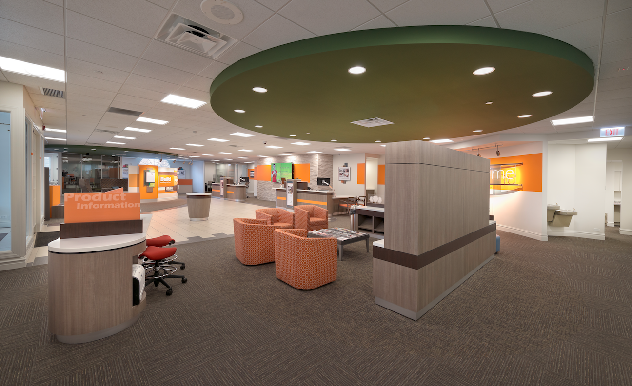
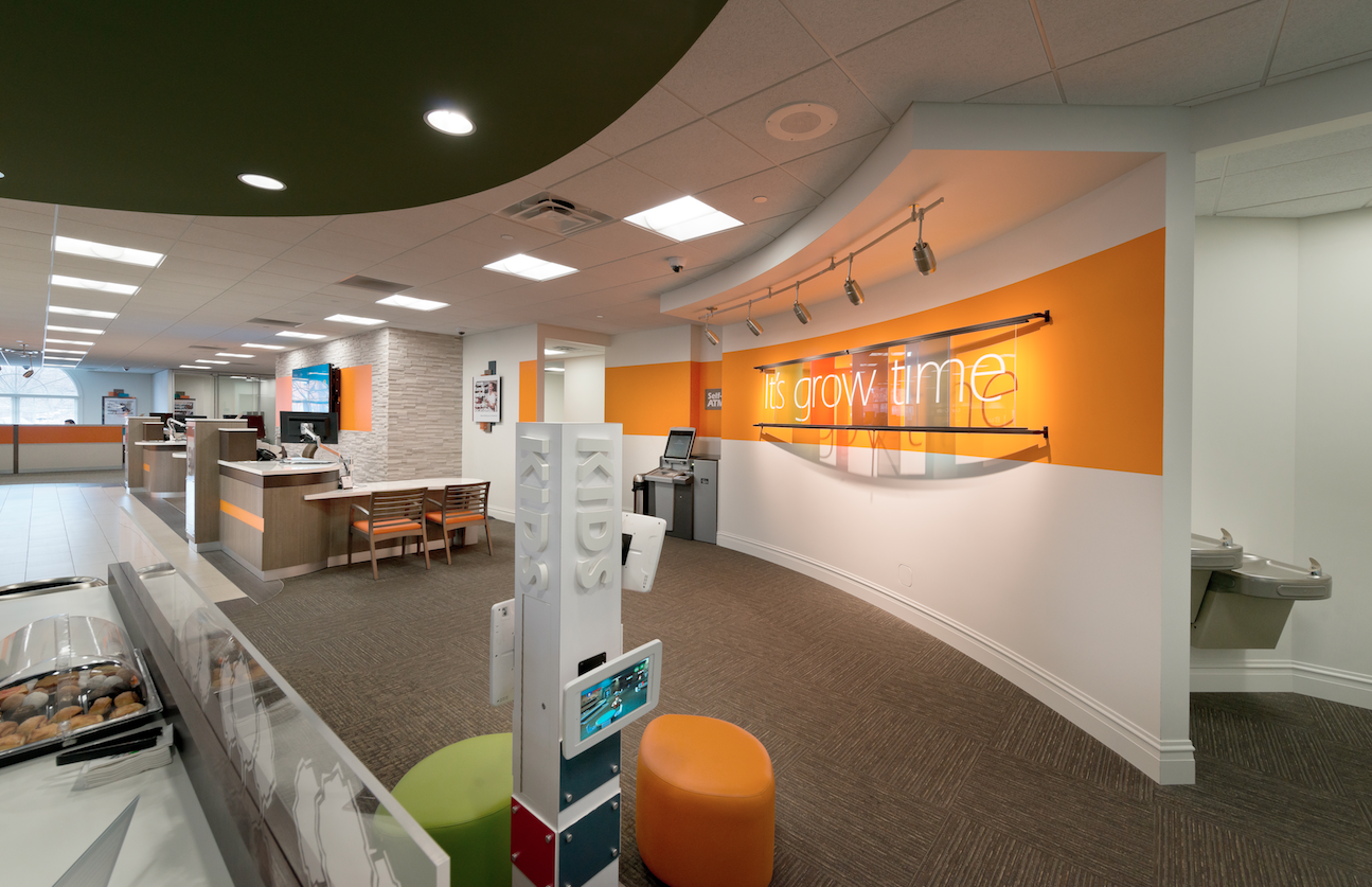
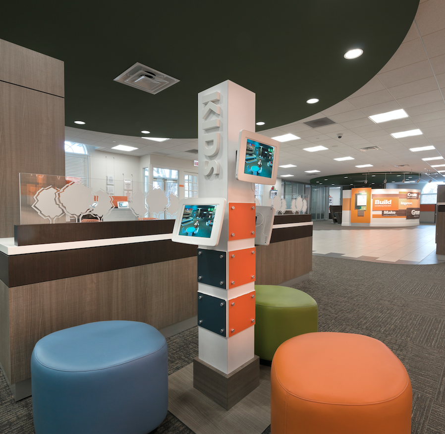
The transformation from a dated experience to a modern, branded, guided, digital lobby with tablets was dramatic.

ELEVATING THE CUSTOMER BRAND EXPERIENCE AT RETAIL.
Transforming the entire customer experience in branch, from entry to every touchpoint, was a fully integrated strategic process. From use of physical space and intuitive technology solutions, to key staffing decisions and training for certain interactions, every element of the experience was reimagined and crafted.
The branch prototype design phase sought to define a modern professional image that would entice new customers and increase wallet share amongst existing clients. Weber Marketing wanted to share a story within the branches that reflected the new brand positioning, and to let customers know what Countryside Bank stands for. Enhancing and elevating the customer experience by being both efficient and unexpected became a focus of the new brand.
Countryside’s core branch team met for two days of participation in a discovery visioning workshop, where all aspects of the business model were prioritized. Here, needed operational shifts were identified to support the new model. The style also needed to reflect the newly defined brand.
BUILDING THE BRANCH OF THE FUTURE.
For Countryside’s CEO John Wheeler, building the branch of the future meant reimagining their business model and altering the convention of a boring traditional bank. “We had some strong ideas about how modern and dynamic we wanted our branch image to be, plus introducing experiences like new tablet technologies, comfortable lounges and highly personal staff service that Weber helped us define,” noted Wheeler.
With a new dynamic prototype branch model in hand, Countryside Bank made the strategic decision to remodel all their branches at one time for maximum impact and efficiencies.
John Mathes, Weber Marketing’s Director of Brand Strategy shared, “Our team converted a print and poster style merchandising system into a robust and modern digital, tablet, print on demand, and environmental branded consumer messaging and engagement program.”
The redesigned executive suite at headquarters supported the CEO’s unique mandate of total openness to customers, access to senior leadership, and transparency. The open concept design gives the branch an upscale vibe, focusing on accessible yet savvy iPad tablet bars and showcases high-touch service and advice.
These changes not only were reflected in the clean design, but also in how the staff interacted with clients. At its heart is a new high-touch concierge model. Giant teller stations gave way to more private and intimate Teller Pods and Smart ATMs. Rather than giving passive financial advice, the staff received empowering brand training from the Weber Marketing team, which focused on advancing customers’ financial knowledge and success. By treating customers in an individualized way, backed by a strong and unified brand, Countryside Bank hoped to successfully reach new target markets.


THERE'S ALWAYS A STORY TO TELL.
Through the use of engaging digital storytelling, the Weber Marketing team worked to create emotional and visceral connections that breathed new life into the Countryside brand personality. Using a combination of eye-catching imagery, lifestyle vignettes, and impactful digital storytelling that focused on the bank’s connections to the community and small businesses, Countryside Bank was able to expand out of its niche market and into a new brand identity rooted in the wider communities they were growing into.
“Our partnership with Weber Marketing helped our team focus on what most needed to change to achieve a lasting brand transformation and drive future growth.”
