More spark for the people moving credit union marketing forward.
MAC is a beloved national network where credit union marketers come together to exchange ideas, build meaningful relationships and move the industry forward.
As the organization approached its 40th year, its identity no longer reflected the energy of its members. MAC needed a brand that felt as welcoming, passionate and refreshingly fun as the community behind it.
The challenge
MAC has never lacked personality. Its members are curious, generous and serious about their craft — but never too serious about themselves.
The organization’s aging logo and limited visual identity told a different story. They lacked the vibrancy and flexibility MAC needed to connect with its growing community across conferences, webinars, digital channels and everything in between.
Turning connection into a spark
Strum partnered with the MAC board to create a new identity rooted in what makes the organization special: dynamic people coming together to share perspectives, inspire one another and make great things happen.
The new mark brings three abstract arrows together in a single circular form. Each arrow suggests an “M.” Together, they create a spark — a symbol of connection, momentum and the energy that radiates when MAC’s members come together.
A distinctive, custom-drawn wordmark completes the logo. Its unconventional letterforms give MAC a confident personality that doesn’t follow the usual rules.
A system made to move
The logo became the starting point for a lively and flexible visual language.
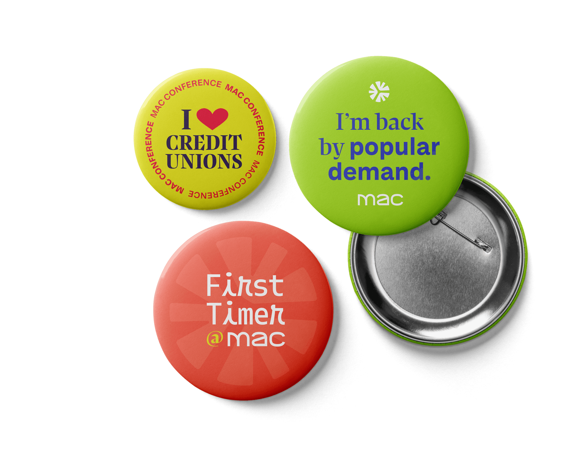
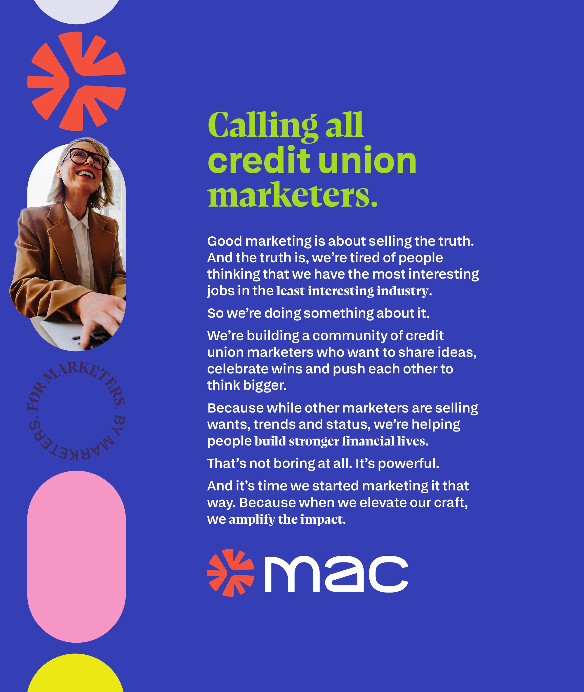
A vivid palette expresses MAC’s bold, optimistic character. An unexpected mix of serif, sans serif and playful monospace typography brings variety and personality to every message. Circles, pills and elongated “bursts,” inspired by the footprint of the mark, hold photography, frame ideas and create a sense of movement.
The system gives MAC plenty of room to play while remaining unmistakably recognizable — from conference communications and event signage to name badges, apparel, social content and digital experiences.
Finding MAC’s voice
The rebrand also clarified how MAC sounds: warm, energetic and confident.
Its voice feels like a trusted colleague — the person who welcomes you in, introduces you to the right people and encourages you to take your next step. It balances genuine expertise with enthusiasm, reflecting an organization that takes its work seriously while leaving plenty of room for fun.
Ready for what’s next
The result is a brand that finally feels like MAC: colorful, collaborative, energetic and full of possibility.
It honors the relationships that have sustained the organization for nearly four decades while giving its community a distinctive identity built for the future.
Because when credit union marketers get together, the best stuff happens.